A design system is a product for other engineers and designers. This guide shows how to build its parts, keep it correct as it changes, and get many teams to use it.
Frontend system design · Pattern
Be able to design tokens, themes, and component APIs for a shared library. Be able to explain how it is tested, versioned, documented, and adopted across a large company.
Correctness contract: Every component meets WCAG 2.2 AA in every theme. A minor or patch release never breaks a consumer's build or behavior. One token change updates every product that uses it, with no hand edits.
You know HTML, CSS, JavaScript, and React or a similar component framework. Tokens, headless components, and visual regression testing are explained below. Numbers are teaching estimates.
Picture a company with 30 product teams and 12 web apps. Each team built its own button. There are now 14 shades of blue, 9 date pickers, and 5 modals, and 3 of those modals trap keyboard users forever. A rebrand would take a year. A design system fixes this by giving everyone one source for colors, spacing, and type, and one set of tested components. But a design system can also fail. If it is hard to use, slow, or breaks apps on upgrade, teams fork it or ignore it. This guide covers both sides: how to build the pieces, and how to run it as a product that teams choose to use.
A token is a named design decision stored as data. It has a name and a value, such as color.text.primary = #111827. Code and design tools read tokens instead of raw values.
Example. A rebrand changes blue.600 from #2563eb to #1d4ed8 in one file. The build updates CSS, iOS, and Android outputs, and every product picks it up on the next release.
Limit. Tokens help only if products use them. A raw hex color in product code bypasses the system. Lint rules must catch that.
Token tiers
Tokens come in layers. Primitive tokens are the raw palette. Semantic tokens say what a value is for. Component tokens say where it is used. Each layer points to the one below it.
Example.button.bg points to color.accent, which points to blue.600 in light mode and blue.300 in dark mode.
Limit. Too many tiers make it hard to trace a value. Three tiers is usually enough. Component tokens are optional for simple components.
Headless component
A headless component gives behavior and accessibility, but no styles. It handles keyboard, focus, and ARIA. You add the look.
Example. A headless Menu handles arrow keys, typeahead, role="menu", and closing on Escape. The styled layer adds colors and spacing from tokens.
Limit. Teams that use only the headless layer can make inaccessible visual choices, such as low contrast. Behavior is safe, looks are not.
Semantic versioning
A version has three numbers: major, minor, and patch. A patch fixes bugs. A minor adds features. A major may break consumers. Consumers use ranges such as ^4.2.0 to accept safe updates.
Example. Adding a size="xs" option is minor, so 4.2.0 becomes 4.3.0. Removing the danger prop is major, so it waits for 5.0.0.
Limit. "Breaking" is wider than API shape. A changed DOM structure, a new focus behavior, or a 2 pixel layout shift can break someone's tests.
Visual regression testing
A test renders each component state in a real browser, takes a screenshot, and compares it to an approved baseline image. Any pixel change beyond a threshold fails the test until a human approves it.
Example. A padding change in Input also shifts DatePicker, which uses it. The screenshot diff shows both, so nobody ships a surprise.
Limit. Fonts, animations, and GPU differences cause flaky diffs. Run in a fixed container, turn off animations, and load fonts before the screenshot.
1. What the system must provide
Treat the design system like a product. Its users are engineers and designers. Write down what they need before you build.
Functional requirements
One token source for color, type, spacing, radius, elevation, and motion, with outputs for every platform.
Light and dark themes, plus room for brand themes for sub-products.
A core set of components: Button, Link, Input, Select, Checkbox, Radio, Switch, Dialog, Menu, Tabs, Tooltip, Toast, Table display, and layout primitives.
Documentation with live examples, usage rules, and accessibility notes.
A design tool kit that matches the code, so designers and engineers speak the same names.
Migration help: changelogs, codemods, and deprecation warnings.
Non-functional requirements
Accessible by default: WCAG 2.2 AA, keyboard support, and screen reader tested.
Small: each component tree-shakes alone. Adding a Button should cost about 3 KB gzipped, not the whole library.
Fast: no runtime style work on the hot path that hurts Interaction to Next Paint (INP).
Stable: semver kept strictly. Breaking changes are rare, planned, and come with codemods.
Works with server-side rendering and with no flash of the wrong theme.
Easy to adopt: works in old and new apps, with clear escape hatches.
Intuition
A design system competes with "I will just build it myself". Every rule you add is a cost to your users. It must give back more than it takes, in speed, quality, or safety.
2. Scope and budgets
Scale
30 teams, 12 web apps, about 400 frontend engineers.
About 60 components after two years. About 250 primitive tokens and 120 semantic tokens.
A core team of 6 to 8 people: designers, engineers, an accessibility specialist, and a part-time technical writer.
Size budgets
Token CSS for one theme: about 4 KB gzipped. Both themes: about 6 KB.
Button: under 3 KB gzipped with its styles. Dialog with focus trap: under 8 KB. Date picker: under 20 KB, and lazy loaded by product code.
No component pulls in a date library or a full icon set by default.
Budgets are enforced in CI with a size check per entry point. A pull request that grows Button by 1 KB fails until someone explains why.
Testing scale
Count screenshots before choosing a tool. 60 components times about 8 stories each is 480 stories. Times 2 themes and 2 viewports is 1,920 screenshots. At about 0.5 seconds each on 8 parallel browsers, a full run takes about 2 minutes. That is fine per pull request. Adding 3 brand themes would push it to almost 5,000 screenshots, so test brands only on the components they change.
Upgrade cost
If a major release forces each of 12 apps to spend 3 engineer-days, that is 36 days of company time. A codemod that cuts this to half a day per app saves about 30 days. So codemods pay for themselves after one major release.
3. Design tokens and their tiers
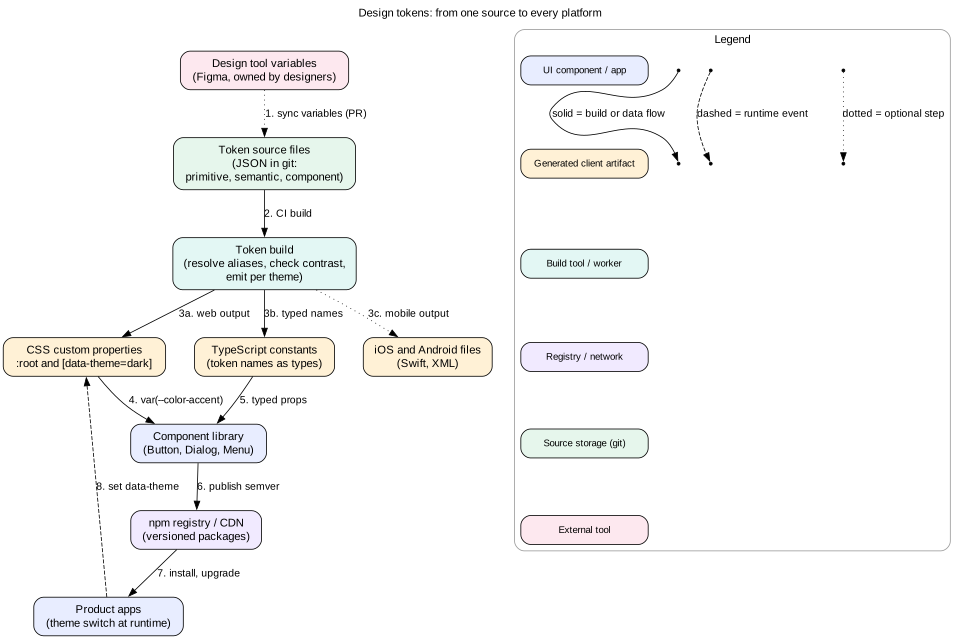
Figure 1. Tokens live in git as data. One build creates every platform's output, so web, iOS, and Android always agree.
The three tiers
Primitive tokens name raw values: blue.600, gray.900, space.4 = 16px, radius.md = 6px. Products should never use them directly.
Semantic tokens name a purpose: color.bg.surface, color.text.muted, color.border.focus, space.inset.md. Themes change these.
Component tokens name a slot in one component: button.primary.bg, input.border.hover. Use them only when a component needs to differ from the semantic default.
Why tiers? Dark mode changes what color.bg.surface points to, but not what button.primary.bg means. A rebrand changes the primitives. Each kind of change touches one layer.
Naming
Use a fixed order: category, then property, then variant, then state. For example color.text.danger.hover.
Name by role, not by look. color.text.danger survives a rebrand. color.red-text does not.
Keep the list small. Every new semantic token is a decision designers must make for every theme.
Format and build
Store tokens as JSON. The W3C Design Tokens Community Group format uses $value and $type fields and {alias} references. A build tool such as Style Dictionary reads the files and writes:
CSS custom properties, such as --color-text-primary, one block per theme.
A TypeScript file that exports token names as a union type, so color="txet.primary" fails to compile.
Swift and Android resources for native apps.
The build also checks rules. It fails on alias cycles, unknown references, and text and background pairs that miss WCAG contrast.
Syncing with design tools
Design tools now have variables that map well to tokens. Pick one source of truth. A common choice is git as truth, with a plugin that opens a pull request when designers change variables. Code review then covers design changes too, and the history is in one place.
Tip
Emit semantic tokens as CSS variables, and have component styles use them with var(). Then a theme switch is one attribute change on <html>. No component re-renders, and no JavaScript runs per component.
Setting data-theme="dark" on <html> swaps every variable at once. The browser recomputes styles in one pass. This costs a few milliseconds even on large pages. The color-scheme property tells the browser to draw scrollbars and native form controls in the matching style.
Following the system setting
Offer three choices: Light, Dark, and System.
For System, use the prefers-color-scheme media query. In JavaScript, listen with matchMedia("(prefers-color-scheme: dark)") and its change event.
Newer CSS has the light-dark() function, which picks a value based on color-scheme. It is a good fit for simple cases. Variables per theme still work in every browser.
No flash of the wrong theme
If React sets the theme after hydration, dark mode users see a white flash on every load. Fix it before first paint. Put a tiny inline script in the document head. It reads the saved choice from localStorage or a cookie, and sets data-theme on <html>. With server rendering, read a cookie on the server and send the right attribute in the HTML.
Dark mode is not inverted light mode
Shadows are hard to see on dark backgrounds. Show elevation with lighter surfaces instead: the higher the layer, the lighter its background.
Pure black next to pure white causes eye strain and halos. Use a dark grey such as #111827 and off-white text.
Saturated colors vibrate on dark backgrounds. Use lighter, less saturated shades for accents, such as blue.300 instead of blue.600.
Check contrast again. Text needs 4.5:1 (WCAG 1.4.3). Large text and UI parts such as borders and focus rings need 3:1 (WCAG 1.4.11). The token build should test every text and background pair in every theme.
Brand themes and scoped themes
A sub-product may need its own accent. Add a brand theme that overrides only a few semantic tokens. Because themes are attribute selectors, they can nest. A marketing banner can set data-theme="dark" on one section of a light page.
Mistake
Storing theme colors in a JavaScript context and passing them as inline styles. Every theme change re-renders the whole tree, server rendering cannot know the theme, and styles cannot be cached. Use CSS variables and let the browser do the work.
5. Component API design
A component API is a contract that hundreds of call sites depend on. It is very hard to change later. Design it with care.
Consistent prop vocabulary
Use the same names everywhere: size takes "sm" | "md" | "lg", variant takes the visual style, tone takes meaning such as "neutral" | "critical".
Avoid boolean explosions such as primary, secondary, and danger as separate booleans. They can conflict. One variant prop cannot.
Events are named onX: onChange, onOpenChange. The first argument is the new value, not a DOM event, when the component owns the value.
Controlled and uncontrolled
Support both. value plus onChange makes the parent the owner. defaultValue lets the component own state. The same pattern applies to open state: open, defaultOpen, and onOpenChange. Warn in development if a component switches between the two modes.
Composition over configuration
A Tabs component with props like tabs={[{label, content, icon, badge, disabled}]} grows a new prop for every request. Compound components scale better:
The parent shares state through context. Each part handles its own ARIA: triggers get role="tab" and aria-selected, panels get role="tabpanel" and aria-labelledby. Consumers can put anything inside a trigger, and the library never needs a badge prop.
Escape hatches
Forward the ref to the main DOM element, so consumers can measure or focus it.
Spread unknown props onto the root element, so data-testid and aria-describedby work.
Accept className and merge it. Without it, teams wrap components in extra divs or fork them.
Offer a way to render as a different element, often called asChild or as. A Button that must be a router link should keep its look and behave as a link.
Expose state as data attributes, such as data-state="open" and data-disabled. Consumers can style states without private class names.
Types as documentation
Use TypeScript to block wrong use. An IconButton can require aria-label in its type, so an unlabeled icon button does not compile. Discriminated unions can say "href is allowed only when as="a"".
Interview
When asked to design a component, start from the call site. Write the JSX a product engineer would type. Then derive the props. Interviewers look for controlled and uncontrolled support, composition, ref forwarding, and ARIA handled inside.
6. Headless vs styled components
Two layers
Behavior layer (headless). Hooks or unstyled parts that handle state, keyboard, focus, and ARIA. Libraries such as React Aria and Radix Primitives work this way.
Styled layer. Your branded components. They wrap the behavior layer and apply token-based styles.
Why split them
Behavior is hard and stable. A correct combobox takes months: typeahead, virtual focus, screen reader announcements, mobile quirks. You want to write it once.
Looks change often: rebrands, new products, marketing pages. Styles should be easy to swap.
Teams with unusual needs, such as a data-heavy trading screen, can use the behavior layer with their own styles and stay accessible.
Build or buy the behavior layer
Building your own gives full control, but costs a lot of specialist time and screen reader testing. Wrapping a mature open-source headless library gives years of bug fixes for free. The risk is dependency on its roadmap. A common choice is to wrap one, and keep your public API your own, so you can swap the inside later.
Which layer do teams import?
Most teams should import only the styled layer. Expose the headless layer as an advanced entry point, such as @acme/ds/primitives. Document that its users own visual accessibility, such as contrast and focus rings.
7. Accessibility baked in
The biggest value of a design system is that accessibility is solved once. If Dialog is correct, 400 engineers get correct dialogs without studying focus traps.
Follow the ARIA Authoring Practices
The WAI-ARIA Authoring Practices Guide (APG) describes the expected keyboard and ARIA behavior for each widget. Implement those patterns exactly. Users of screen readers expect a menu to behave like every other menu.
What each component must handle
Focus. Dialog moves focus inside on open, traps Tab within, and returns focus to the trigger on close. Menus and toolbars use roving tabindex, so the group is one Tab stop and arrows move inside.
Visible focus. Use :focus-visible to show a focus ring for keyboard users. The ring uses a token with 3:1 contrast against every background.
Names and roles. Inputs always have a label. The Field component connects label, hint, and error with for and aria-describedby, so teams cannot forget.
Announcements. Toasts use a live region. Form errors are announced when submit fails.
Motion. All animations check prefers-reduced-motion. Motion tokens have a reduced value.
Target size. Interactive targets are at least 24 by 24 CSS pixels (WCAG 2.5.8). Touch targets should be closer to 44 pixels.
Native first. Use a real <button> and a real <input type="checkbox"> under the styling. The native <dialog> element and the Popover API now handle top layer and light dismiss in modern browsers.
Testing accessibility
Run axe on every story in CI. It catches missing labels, bad ARIA, and contrast issues. Automated tools find only part of real problems, so they are a floor, not a proof.
Write keyboard tests with Testing Library: tab to the trigger, press Enter, check focus moved, press Escape, check focus returned.
Do manual screen reader passes before each minor release: VoiceOver with Safari, NVDA with Firefox or Chrome, and TalkBack on Android.
Add lint rules for product code, such as "no click handler on a div".
Mistake
Adding ARIA to fix a div that should be a button. <div role="button"> still needs tabindex, Enter and Space handling, and disabled logic. A native <button> gives all of that for free.
8. Versioning and deprecation
Package layout
Publish tokens, icons, and components as separate packages, such as @acme/tokens, @acme/icons, and @acme/react. A token change does not force a component upgrade.
Declare react as a peerDependency. Then the app provides one React, and the library does not bring a second copy.
Avoid two versions of the library in one page. Two copies mean two theme contexts, and components from one copy cannot see the other's provider. Use a package manager check, such as a dedupe step in CI.
What counts as breaking
Removing or renaming a prop, a component, or a token.
Changing default behavior, such as a dialog that now closes on outside click.
Changing DOM structure that consumers could select, such as moving the id to another element.
Large visual changes, such as a new size scale. Small polish is usually minor, but announce it.
Release flow
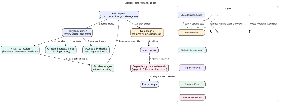
Each pull request adds a changeset file that says "patch", "minor", or "major" and a sentence for the changelog. The release job reads these, bumps versions, writes the changelog, and publishes. Reviewers check the level, because a wrong "minor" breaks 12 apps.
Deprecation, step by step
Add the new API next to the old one in a minor release.
Mark the old one with a JSDoc @deprecated tag. Editors show it with a strike-through.
Log a development-only warning once per page: "Button danger is deprecated. Use tone="critical". Run the codemod ds-codemod button-tone."
Ship a codemod that rewrites call sites automatically, using a tool such as jscodeshift.
Measure remaining usage by scanning all repos. Help the last few teams directly.
Remove the old API in the next major, at least one quarter later.
Support window
Support the current major and the previous one for security and critical bug fixes, for example for 6 months. Longer windows split your team's time across branches.
9. Documentation and visual regression testing
Figure 2. Stories are the single list of states. Docs, tests, and screenshots all read from them.
Stories as the source of states
Write one story for each meaningful state: default, hover, focus, disabled, loading, error, long text, right-to-left, and each size. Tools like Storybook render stories in isolation. The same stories feed the docs site, the interaction tests, the axe scan, and the screenshot tests. One list, four uses.
What good docs contain
A live example at the top that can be edited and copied.
When to use it, and when to use something else. "Use Menu for actions. Use Select for choosing a value in a form."
Do and don't examples with pictures.
The props list, generated from TypeScript types so it is never out of date.
Accessibility notes: keyboard keys, what the screen reader says, and what the consumer must still provide.
Status labels such as Beta, Stable, and Deprecated, and links to the changelog and design kit.
Visual regression in practice
Render each story in a headless browser, such as Playwright's Chromium, inside the same Docker image every time. Different operating systems draw fonts differently.
Wait for fonts with document.fonts.ready. Turn off animations and transitions with a test-only style. Freeze dates and random values.
Compare with a small pixel threshold to ignore anti-aliasing noise. Show the diff image in the pull request.
A human approves intended changes. The approved screenshots become the new baseline.
Run screenshots for both themes and two widths, such as 375 and 1280 pixels.
Tip
Track the flake rate. If more than about 1 in 50 runs shows false diffs, people start approving without looking. Then the tests give false safety. Fix flakes as seriously as real bugs.
10. Adoption across teams
A perfect library that nobody uses has no value. Adoption is a product and people problem as much as a technical one.
Operating model
Central team. A small team owns tokens, core components, and quality. Fast and consistent, but can become a bottleneck.
Federated contributions. Product engineers contribute components through a clear process. The core team reviews for API, accessibility, and tests. This scales, but needs strong review.
Most companies mix both: core team for foundations, contributions for the long tail.
Make the right thing easy
Provide starter templates and a CLI that sets up the library, fonts, and theme in a new app in minutes.
Add lint rules: no raw hex colors, no pixel values outside the spacing scale, prefer DS components over native ones where one exists.
Offer escape hatches, such as className and the headless layer, so teams do not fork when they hit an edge case.
Hold office hours and keep a public request board. Answer within days, not months.
Measure adoption
Scan all repos with a static analysis script. Count imports of DS components versus local look-alikes.
Track version spread: how many apps are on the latest major, and how many are two majors behind.
Count raw color and spacing values in product CSS. The number should fall over time.
Survey users each quarter for satisfaction and top pain points.
Migrating an old app
Do not ask a team to rewrite their app. Start with tokens: map their colors to semantic tokens so theming works. Then replace the most-used components one at a time, often Button, Input, and Dialog first. Each step ships alone and gives value alone.
Intuition
Teams adopt a system when it saves them time this week. They resist it when it only promises consistency next year. Lead with things that save time: dark mode for free, accessible dialogs, and faster builds.
11. Bundle size and CSS strategy
Tree shaking
Ship ES modules. Bundlers can only drop unused exports from ESM.
Set "sideEffects" in package.json so bundlers know which files are safe to drop. List CSS files as side effects, or they disappear.
Offer per-component entry points through the exports field, such as @acme/react/button. This helps tools that do not tree-shake well.
Do not bundle a whole icon font. Export each icon as its own component, so an app ships only the 30 icons it uses, not all 2,000.
How styles are delivered
Runtime CSS-in-JS. Styles are computed and injected during render. Very flexible. But it adds a runtime of 10 KB or more, does work on every render, and makes server streaming harder. Under heavy updates it can hurt INP.
Zero-runtime CSS-in-JS or CSS Modules. Styles are extracted to static CSS at build time. No runtime cost, and the browser can cache the CSS. Dynamic values go through CSS variables.
Utility CSS. Classes map to tokens, such as bg-surface. Very small CSS that grows slowly. Component markup gets long, and the utility config must be generated from tokens.
For a shared library, static CSS plus CSS variables is the safest choice. It works with any framework, any rendering mode, and any bundler.
Specificity and isolation
Library styles should be easy to override, not fight product styles. Put library styles in a CSS cascade layer, such as @layer ds. Unlayered product styles then win without !important. Prefix class names, such as ds-, to avoid clashes with old global CSS.
Enforce budgets
Run a size check per entry point in CI, with tools such as size-limit. Report the change in every pull request. Keep a dashboard of the gzipped size of each component over time.
12. Failure modes
Breaking change shipped as minor. Apps break on a routine update. Prevent it with changeset review, API extractor reports that diff the public types, and canary builds of the top apps in CI.
Duplicate library copies. Themes and context break in odd places. Use peer dependencies and a dedupe check.
Dark mode contrast failure. A new token pair passes in light and fails in dark. The token build must test every pair in every theme.
Theme flash on load. Theme set after hydration. Set it in the HTML or with a tiny head script.
Flaky screenshots. Reviewers approve blindly and real regressions slip through. Fix fonts, animations, and the render environment.
Forks. A team copies a component to add one feature. Now bug fixes do not reach them. Respond fast to requests and provide escape hatches.
Bundle creep. One component imports a large dependency and every app pays. Enforce per-entry budgets.
Docs drift. Docs show props that no longer exist. Generate props from types and render examples from real stories.
13. Trade-offs
Strict system vs flexible system
Strict: strong consistency and accessibility, fewer bugs. Teams with unusual needs feel blocked and may fork.
Flexible: easy to adopt and extend. The product slowly drifts back to many styles.
Choice: strict tokens and behavior, flexible layout and composition.
Build the behavior layer vs wrap a library
Build: full control, no outside dependency. Very expensive to make correct across browsers and screen readers.
Wrap: mature behavior quickly. You depend on another project's roadmap and bugs.
Monolithic package vs many packages
One package: one version to track, simple upgrades. Every change bumps everything.
Many packages: fine-grained upgrades. Version mixes can break, and releases are more complex.
Choice: a few packages split by change rate, such as tokens, icons, and components.
Runtime CSS-in-JS vs static CSS
Runtime: flexible styling from props. Costs runtime size and render work.
Static: fast, cacheable, framework-agnostic. Dynamic styling goes through variables and data attributes.
14. Interview angle
A common prompt is "Design a component library for a company with 50 teams" or "Design a Select component". Strong answers cover:
Users and goals first. Who uses it, how many apps, which frameworks, which platforms.
Tokens and tiers. Primitive, semantic, and component. CSS variables for runtime theming.
API from the call site. Controlled and uncontrolled, composition, refs, escape hatches, typed props.
Accessibility inside. APG patterns, focus management, tests with axe plus manual screen readers.
Change management. Semver, changesets, deprecation steps, codemods, support window.
Adoption. Operating model, lint rules, metrics, migration path for old apps.
Interview
A staff-level signal is talking about the organization, not only code. Mention who approves breaking changes, how you measure adoption, and how you stop forks. Then tie it back to numbers, such as upgrade cost across 12 apps.
15. Summary
Tokens are design decisions as data, in three tiers: primitive, semantic, and component. One build emits every platform's output.
Themes are CSS variable sets switched by one attribute. Set the theme before first paint and test contrast in every theme.
Component APIs use a shared vocabulary, controlled and uncontrolled modes, composition, refs, and escape hatches.
Split behavior (headless) from looks (styled). Accessibility lives in the behavior layer and is tested in CI and by hand.
Keep semver strict. Deprecate in steps with warnings, codemods, and usage scans.
Stories feed docs, tests, and screenshots. Visual tests need a fixed environment to stay trusted.
Adoption needs a product mindset: easy setup, lint rules, fast support, and measured progress.
16. Common mistakes
Letting products use primitive tokens like blue.600 directly, which breaks theming.
Theming through JavaScript context and inline styles instead of CSS variables.
Boolean prop explosions instead of one variant prop.
No className, ref, or prop spreading, which forces forks.
Treating axe as proof of accessibility.
Shipping breaking changes in a minor release.
Shipping a whole icon set or a date library in the main entry.
Measuring success by components built instead of components adopted.
Worked example: renaming a Button prop across 12 apps
Designers decide that variant="danger" should become tone="critical", because "danger" mixes look and meaning. The library is at 4.6.0. Here is how the change rolls out without breaking anyone.
An RFC explains the change and the plan. The design system council approves it. The target is removal in 5.0.0, one quarter later.
In 4.7.0 (minor), Button accepts tone. The old variant="danger" still works and maps to tone="critical" inside. Screenshots show no pixel change for both forms.
The TypeScript type marks "danger" with @deprecated. Editors show it struck through.
In development builds, Button logs one warning per page that names the codemod. Production builds strip the warning.
The team ships a jscodeshift codemod. It rewrites variant="danger" to tone="critical", and flags dynamic values such as variant={v} for a human.
A usage scan across all repos finds 412 call sites in 12 apps. The dependency bot opens upgrade pull requests that bump to 4.7.0 and run the codemod. 9 apps merge within two weeks.
The scan shows 37 sites left in 3 apps, mostly dynamic values. A core engineer pairs with those teams for an afternoon each.
The scan reaches zero. 5.0.0 removes "danger" from the type and the runtime mapping. The changelog links the codemod for any late upgraders.
The 4.x line gets security fixes for 6 more months, then it is closed.
Total cost: about 2 engineer-weeks for the core team and less than 1 hour per product team. A hand migration would have cost about 36 engineer-days.
Code lab: resolve tokens into themed CSS
This script models a tiny token build. It resolves {alias} references through three tiers, emits a CSS block per theme, and fails clearly on alias cycles and unknown tokens. Save it as tokens.mjs and run node tokens.mjs with Node 18 or later.
Expected output: a :root block where --button-bg is #2563eb, and a dark block where it is #93c5fd. Then two errors: Alias cycle: a -> b -> c -> a and Unknown token: color.border (from button.border). As an exercise, change the build so component tokens emit var(--color-accent) instead of the final hex value. Then the dark block no longer needs to repeat component tokens at all.
Check yourself
Why should product code use color.text.danger and not red.600?Answer
The semantic token names a purpose, so each theme can point it at a different primitive. Dark mode can use a lighter red, and a rebrand can change the palette, with no product code changes. A primitive used directly stays the same in every theme.
How do you avoid a white flash for dark mode users on page load?Answer
Set data-theme before first paint. With server rendering, read a cookie and put the attribute in the HTML. Otherwise use a tiny inline head script that reads the saved choice. Do not wait for React hydration.
Why are compound components often better than a big config prop for Tabs?Answer
Consumers can put any content in each part, so the library does not need a new prop for every request such as icons or badges. Each part still handles its own ARIA and keyboard behavior through shared context.
A team changes the default of Dialog to close on outside click. Is that a minor release?Answer
No. It changes default behavior that consumers rely on, for example forms in dialogs could lose data. It is a breaking change. Ship it behind an opt-in prop in a minor release, and change the default only in a major.
Why should the library declare React as a peer dependency?Answer
So the app supplies one copy of React. If the library bundled its own, hooks and context would break, because components would run against two different React instances.
Your visual tests fail randomly on 1 run in 10. What do you check first?Answer
The environment: run in one fixed Docker image, wait for document.fonts.ready, turn off animations and transitions, and freeze time and random data. Flaky tests train people to approve diffs without looking.
Key terms
Design token
A named design decision stored as data, such as a color or a spacing value.
Primitive token
A token that names a raw value in the palette or scale.
Semantic token
A token that names a purpose and points to a primitive. Themes change these.
CSS custom property
A CSS variable such as --color-accent, read with var() and changed at runtime.
color-scheme
A CSS property that tells the browser which color schemes a page supports, for native controls and scrollbars.
Headless component
A component that provides behavior and accessibility with no styles.
Compound component
A component made of parts, such as Tabs.List and Tabs.Panel, that share state through context.
Controlled component
A component whose value is owned by the parent through value and onChange.
Changeset
A small file in a pull request that states the version bump level and the changelog text.
Codemod
A script that rewrites source code automatically, used to migrate call sites.
Visual regression test
A test that compares screenshots of components with approved baseline images.
Cascade layer
A CSS @layer that sets the priority of a group of styles, independent of selector specificity.