A frontend system design walkthrough for a photo first app. You will learn to serve the right image size to every screen and to prepare and upload photos on the client. You will also lay out grids that never jump and stay inside phone memory limits.
Frontend system design · Classic design question
After this page you can design the web client for a photo sharing product. You can explain responsive images, image CDN transforms, a worker based upload pipeline, grid and lightbox rendering, stories, and image memory on mobile.
Correctness contract: every image box has its final size before the image loads. An upload the user started is never silently lost, and it never posts twice. The app never loads more decoded image memory than the device can hold.
Assumptions: a mobile first web app or PWA. An image CDN can resize and change format on the fly. An object store accepts chunked uploads. Most users are on phones, many on mid range Android devices.
In a photo app, images are the product. They are also the biggest cost in bytes, in decode time, and in memory. A single phone photo can be 12 megapixels and 5 MB. Shown at full size on a 400 pixel wide screen, it wastes 95 percent of its bytes and about 48 MB of decoded memory. The client must ask for the right size, show something useful before the bytes arrive, and release memory when images leave the screen. Uploads have the opposite problem. The client holds a huge original file on a weak network, and it must shrink it, fix its orientation, and send it reliably. This page covers both paths.
srcset lists the same image at several widths. sizes tells the browser how wide the image will be on screen. The browser combines this with the device pixel ratio and picks the smallest file that is sharp enough.
Example. A grid tile is one third of a 390 pixel screen at 3x density. It needs about 390 real pixels, so the browser picks the 400w file, not the 1080w file.
Limit. The browser chooses before layout. If sizes is wrong, it picks the wrong file. Browsers may also keep a larger cached file instead of fetching a smaller one.
Image CDN transforms
An image CDN resizes, crops, compresses, and changes format based on URL parameters or request headers. The client asks for exactly the size it needs. The CDN creates that variant once and caches it at the edge.
Example./p/abc.jpg?w=640&q=75&fm=auto returns a 640 pixel AVIF to Chrome and a JPEG to an old browser.
Limit. Every unique width is a new cache entry. Allow only a fixed list of widths, or cache hit rate drops and cost goes up.
EXIF orientation
Cameras store the pixels in sensor order and add an EXIF tag that says how to rotate them. A photo taken in portrait may be stored landscape with "rotate 90 degrees" in the metadata.
Example. A user uploads a portrait photo. A naive canvas resize ignores the tag, and the posted photo is sideways.
Limit. Modern browsers apply EXIF orientation to <img> and to createImageBitmap by default. Old code that also rotates manually ends up rotating twice.
Layout shift
Layout shift happens when visible content moves because something above it changed size. Images without reserved space are the most common cause. Google measures it as Cumulative Layout Shift (CLS). A good score is under 0.1.
Example. A user is about to tap "Like". The image above loads and grows from 0 to 500 pixels tall. The user taps the wrong post.
Limit. CLS ignores shifts within 500 ms of a user input. That does not make those shifts pleasant.
Placeholders (LQIP and blurhash)
A placeholder shows the shape and color of an image before it loads. LQIP is a tiny, blurry version of the image, often under 1 KB. Blurhash encodes the blur into a short string of about 20 to 30 characters that the client decodes into pixels.
Example. The server sends blurhash: "LEHV6nWB2yk8pyo0adR*.7kCMdnj". The client paints a soft color blob in the image box at once.
Limit. Decoding blurhash costs CPU. Decoding 30 on the main thread at once can cause jank. Decode at a small size, such as 32 by 32, and scale up with CSS.
Decoded image memory
A compressed file is small. To draw it, the browser decodes it into a bitmap of width times height times 4 bytes. This bitmap is what fills memory, not the file size.
Example. A 150 KB JPEG at 1080 by 1350 pixels decodes to about 5.8 MB. Twenty of them is about 117 MB.
Limit. Browsers discard decoded bitmaps for off screen images on their own schedule. You cannot control this directly, only by removing or shrinking images.
1. Clarifying questions and requirements
Which surfaces? Home feed, profile grid, explore grid, post detail, stories, upload flow. Which matter most for this interview?
Photos only or video too? Video adds streaming and a much heavier upload.
Single photo or carousel posts? Carousels of up to 10 or 20 photos change the upload and the viewer.
Editing on the client? Crop, filters, and stickers need canvas or WebGL work.
Aspect ratios? Square only, or a range such as 4:5 to 1.91:1?
Offline? Should uploads continue after the user closes the tab?
Functional requirements
Browse a feed and a profile grid of photos with infinite scroll.
Open a photo in a full screen lightbox, and swipe through carousel posts.
View stories: full screen, auto advancing, tap to skip.
Upload one or more photos with crop, caption, and progress.
Resume an interrupted upload without starting over.
Like and comment, with optimistic updates.
Non-functional requirements
LCP under 2.5 s on 4G for the first feed photo.
CLS under 0.1 on every screen.
Scrolling the grid and swiping the carousel at 60 fps on a mid range phone.
Bytes per photo view under about 150 KB on a phone.
Upload of a 12 megapixel photo finishes in under 10 s on a 5 Mbps uplink.
No out of memory tab crashes after 30 minutes of browsing.
Images have text alternatives. All controls work with keyboard and screen readers.
Interview
Ask which path to focus on: viewing or uploading. Many interviewers want both at a high level and one in depth. Viewing is about bytes and layout. Uploading is about workers, reliability, and progress.
2. Scope and budgets
Device and screen
Typical phone: 390 CSS pixels wide, device pixel ratio 3. So a full width image needs about 1,170 real pixels.
Mid range Android: device pixel ratio 2 to 2.75, a slower CPU, and 3 to 4 GB of RAM shared with every other app.
Network: 4G at 5 to 10 Mbps down and 1 to 5 Mbps up, with 100 ms round trips.
Bytes per image
A 1080 pixel wide photo as JPEG at quality 75: about 150 to 250 KB.
The same as WebP: about 25 to 35 percent smaller. As AVIF: often 40 to 50 percent smaller.
A grid tile at 400 pixels as AVIF: about 15 to 25 KB.
A profile grid of 30 tiles: about 600 KB with AVIF tiles, compared with 6 MB if you lazily served 1080 pixel files.
Decoded memory
One 1080 by 1350 feed photo: 1080 times 1350 times 4 bytes, about 5.8 MB.
One 400 by 400 grid tile: about 0.64 MB.
A 12 megapixel original during upload: 4000 times 3000 times 4 bytes, 48 MB. Two copies during a resize: about 100 MB.
Mobile Safari may kill a tab well before 1 GB, sometimes at a few hundred MB on older devices. Plan to keep decoded images under about 150 to 200 MB.
Frame budget
A frame is 16.7 ms at 60 Hz. Decoding a 1080 pixel JPEG can take 10 to 30 ms on a slow phone. If decoding happens on the main thread during a swipe, frames drop. Use decoding="async" on images, or call img.decode() before showing the next carousel slide. Never decode a 12 megapixel upload on the main thread.
DOM and bundle
A profile with 2,000 posts must not create 2,000 <img> elements. Window the grid by rows.
Initial JavaScript for the feed: under 150 KB compressed. The upload editor with filters loads on demand, since only a small share of sessions upload.
3. High-level architecture
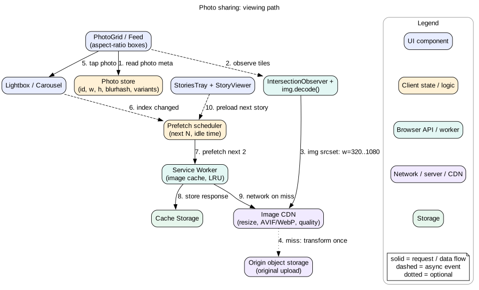
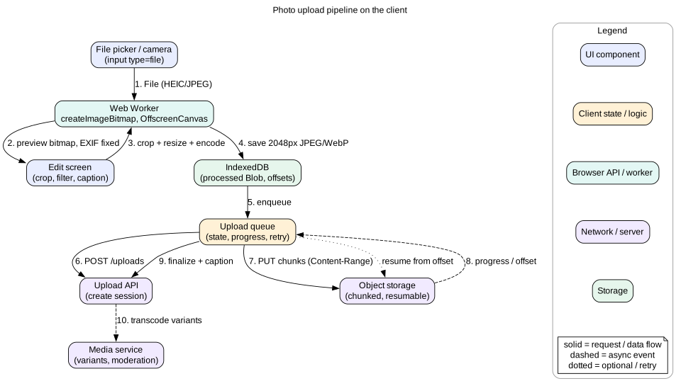
The app has two main paths that share a photo store.
A photo store with ids, dimensions, placeholders, and variant URLs.
A prefetch scheduler that warms the next images during idle time.
A Service Worker that caches recently viewed images in Cache Storage with a size cap.
An image CDN in front of the original files.
Figure 1. Viewing path. Metadata first, then the right size from the CDN, with prefetch for what comes next.
Upload path
A file picker or camera input, an edit screen, and a post composer.
A Web Worker that decodes, orients, resizes, and encodes the image.
An upload queue that stores processed files in IndexedDB and sends them in resumable chunks.
An upload API that creates sessions and a media service that builds server variants.
Figure 2. Upload pipeline. Heavy work happens in a worker. IndexedDB makes the upload survive reloads.
4. Data model
interface Photo {
  id: string
  width: number                // original pixel size after orientation
  height: number
  blurhash: string             // or lqipDataUrl
  dominantColor: string        // "#a38f7c", fallback background
  baseUrl: string              // CDN path, widths added by the client
  alt: string                  // user text or generated description
}

interface Post {
  id: string
  authorId: string
  photoIds: string[]           // 1 for single, up to 10 for carousel
  caption: string
  likeCount: number
  likedByMe: boolean
  createdAt: string
}

interface Story {
  id: string
  authorId: string
  photoId: string
  durationMs: number           // usually 5000 for a photo
  expiresAt: string
  seen: boolean
}

type UploadStatus = "processing" | "queued" | "uploading" | "paused" | "finalizing" | "done" | "failed"

interface UploadJob {
  jobId: string                // client id, used as idempotency key
  sessionUrl?: string          // from the server, for resume
  blobKey: string              // IndexedDB key of the processed file
  size: number
  uploadedBytes: number        // confirmed by the server
  status: UploadStatus
  caption: string
  attempt: number
}

interface Store {
  photos: Record<string, Photo>
  posts: Record<string, Post>
  stories: Record<string, Story[]>     // by author
  grids: Record<string, { ids: string[]; cursor: string | null }>
  uploads: Record<string, UploadJob>
}
The most important fields are width and height. They must be the size after EXIF orientation. With them, the client can reserve the exact box for every image before any byte arrives. The baseUrl lets the client build CDN URLs for any allowed width. The server does not need to send a long list of variant URLs.
5. Interface and API
Server API
GET  /api/feed?after=<cursor>                 -> posts + photos (side loaded)
GET  /api/users/:id/posts?after=<cursor>      -> grid page
GET  /api/stories/tray                       -> authors with unseen stories

POST /api/uploads   { jobId, size, mime }     -> { uploadId, sessionUrl, chunkSize }
PUT  <sessionUrl>   Content-Range: bytes 0-1048575/4200000   (chunk body)
     -> 308 Range: bytes=0-1048575   (more expected) | 201 { photoId }
HEAD <sessionUrl>   -> Upload-Offset or Range header, to resume
POST /api/posts     { jobId, photoIds, caption }   Idempotency-Key: <jobId>
This follows the shape of common resumable upload protocols, such as the one used by Google Cloud Storage and the open tus protocol. The client asks where to continue, then sends the rest. The jobId doubles as an idempotency key. If the network drops right after "create post", a retry does not post the photo twice.
Set Cache-Control: public, max-age=31536000, immutable on image responses. A photo id never changes its pixels. An edited photo gets a new id or version. Use Vary: Accept if the CDN picks the format from the Accept header, or use separate URLs per format.
<img
  src="https://img.example.com/p/abc?w=640"
  srcset="https://img.example.com/p/abc?w=320 320w,
          https://img.example.com/p/abc?w=640 640w,
          https://img.example.com/p/abc?w=1080 1080w"
  sizes="(max-width: 600px) 100vw, 600px"
  width="1080" height="1350"
  alt="Sunset over the harbor with two sailboats"
  loading="lazy" decoding="async">
width and height give the aspect ratio. Modern browsers use them to reserve space even when CSS sets width: 100% and height: auto.
sizes must match your CSS. If the image is full width on phones and 600 pixels on desktop, say exactly that.
For the first visible photo, the likely LCP element, drop loading="lazy" and add fetchpriority="high". You can also add a <link rel="preload" as="image" imagesrcset="..." imagesizes="..."> in the head for server rendered pages.
Use <picture> with <source type="image/avif"> when the CDN cannot negotiate formats from the Accept header.
Choosing widths
Each extra width adds a CDN cache entry per photo. Too few widths waste bytes. Seven widths between 160 and 1440 pixels keep the waste under about 20 percent for any screen. Round requested widths up to the nearest allowed width on the client. Never request w=413.
Device pixel ratio caps
A 3x phone does not need a true 3x image for a photo. Most people cannot tell 2x from 3x in a photo, but 3x costs about 2.25 times the pixels. Cap at 2x for photos. This saves a lot of data with no visible loss. Keep text and icons sharp with SVG.
Data saver
When navigator.connection.saveData is true, or the network is slow, choose a lower quality such as q=50 and cap at 1x. Some CDNs read the Save-Data request header and do this for you.
Tip
Say the numbers: a 390 pixel wide phone at a 2x cap needs about 800 pixels. Serving a 4000 pixel original wastes about 25 times the pixels. This is the most important optimization in a photo app.
7. Deep dive: the client upload pipeline
Why process on the client
A phone photo is 3 to 6 MB. On a 2 Mbps uplink that is 12 to 24 seconds. Resizing to 2,048 pixels and encoding at quality 85 brings it to about 400 to 700 KB. That uploads in 2 to 3 seconds. The server still makes its own variants. The client resize only saves upload time and server bandwidth.
The steps
Pick.<input type="file" accept="image/*" multiple>. On mobile, the capture attribute can open the camera directly.
Decode in a worker. Send the File to a Web Worker. Call createImageBitmap(file, { imageOrientation: "from-image" }). This decodes off the main thread and applies EXIF orientation.
Preview. Make a small bitmap, about 1,080 pixels, for the edit screen. Transfer it back to the main thread as a transferable object, so it is moved, not copied.
Edit. The user crops and picks a filter. Record the crop rectangle and filter as parameters, not as pixels.
Render the final image. In the worker, draw the original onto an OffscreenCanvas with the crop applied, at a maximum of 2,048 pixels on the long edge. Apply the filter with canvas filters or WebGL.
Encode. Call canvas.convertToBlob({ type: "image/jpeg", quality: 0.85 }). Use WebP if the server accepts it. Encoding strips EXIF, which also removes GPS location. That is good for privacy, but tell the user if you keep or drop location.
Store. Save the processed Blob in IndexedDB with the job record. Close the bitmaps with bitmap.close() to free memory at once.
Upload. Create a session, then send chunks.
HEIC files from iPhones need care. Safari can decode HEIC. Chrome on desktop often cannot. One option is to let iOS convert at pick time. It often does this when accept asks for JPEG. Another option is to upload the original and let the server convert. Always have a fallback when createImageBitmap fails.
Resumable chunked upload
Use chunks of about 1 to 8 MB. Smaller chunks waste round trips. Larger chunks lose more work on a drop.
Send chunks in order with a Content-Range header. After each chunk, the server confirms the offset.
On a network error, wait with backoff, ask the server for the current offset with HEAD, and continue from there.
Store sessionUrl and uploadedBytes in IndexedDB. After a reload, the queue resumes from the stored offset.
For multi photo posts, upload 2 or 3 files in parallel. More than that splits a weak uplink and makes every file slower.
Progress
Use XMLHttpRequest and xhr.upload.onprogress for byte level progress within a chunk. Fetch upload progress is not widely available. Show overall progress as confirmed bytes plus in flight bytes, divided by total. Split the bar: processing 10 percent, upload 85 percent, finalize 5 percent. A bar that sits at 100 percent while the server finalizes feels broken.
Let the user move on
After the user taps "Share", show the post at the top of their feed at once with a small progress ring. The upload continues in the background while they browse. On page close, warn only if an upload is still in progress. Background Sync in a Service Worker can retry later on browsers that support it, but do not depend on it everywhere.
Mistake
Resizing on the main thread with a regular canvas. A 12 megapixel decode and draw can block the main thread for 300 to 800 ms on a phone. The page freezes, and the progress bar cannot even animate.
8. Deep dive: grid and masonry without layout shift
Square grid
The profile grid uses square tiles cropped from the center. Use CSS Grid with grid-template-columns: repeat(3, 1fr) and aspect-ratio: 1 on each tile with object-fit: cover. Every tile has its size before load. CLS is zero.
Justified rows
The Flickr style layout keeps each photo's real aspect ratio. Photos are packed into rows of equal height that exactly fill the width. Algorithm: add photos to a row until the row, at a target height, would be wider than the container. Then scale the row height so the widths sum to exactly the container width. The code lab below implements this. Because the client knows every aspect ratio from metadata, it computes the whole layout before any image loads.
Masonry
Masonry places items in columns of equal width and variable height, like Pinterest. Place each new item in the shortest column. Compute positions in JavaScript from known aspect ratios, and use absolute positioning or CSS transforms. CSS has an experimental native masonry layout, but support is not universal yet. Do not depend on it.
Masonry breaks reading order. Items 1, 2, 3 may land in columns 1, 3, 2. Make sure DOM order follows a sensible tab order, or keyboard users jump around.
Re-layout on resize with a ResizeObserver on the container. Debounce to one layout per animation frame.
Windowing a grid
Window by rows, not by items. A 3 column grid with 2,000 posts has about 667 rows. With rows of 130 pixels, render the 6 to 8 visible rows plus 3 rows of overscan each side. Use IntersectionObserver on a sentinel to load the next page of posts. Images in unmounted rows are released, which keeps memory bounded.
Intuition
A grid is a parking lot with painted spaces. Paint every space before the cars arrive, using the size you already know. Then no car pushes another out of its space when it parks.
9. Deep dive: lightbox, carousel, and stories
Lightbox
Open with a shared element transition. The grid tile grows into the full image. The View Transitions API makes this simpler in supporting browsers. Use a FLIP animation with transforms as a fallback.
Show the tile image, already decoded, scaled up first. Swap to the larger image once img.decode() resolves. The user sees no blank frame.
Use the <dialog> element with showModal(). It traps focus, makes the rest of the page inert, and closes on Escape. Return focus to the tile on close.
Push a history entry, such as /p/abc, so the back button closes the lightbox and links are shareable.
Support pinch zoom with pointer events and CSS transforms. Load a larger variant, such as 1440 or 2048 pixels, only when the user zooms.
Carousel
Use CSS scroll snap: scroll-snap-type: x mandatory on the track and scroll-snap-align: center on slides. The browser handles momentum and snapping on the compositor thread. That is smoother than JavaScript dragging.
Render the current slide plus one on each side. Later slides get only a placeholder until near.
Track the active slide with IntersectionObserver at a 0.6 threshold. Update the dots indicator.
Give each slide role="group" with aria-roledescription="slide" and a label like "2 of 5". Add Previous and Next buttons for keyboard and screen reader users.
Stories
Full screen viewer with a progress bar per item. Each photo shows for about 5 seconds.
Drive the timer with requestAnimationFrame and elapsed time, not with setInterval. Pause on press and hold, and when visibilitychange says the tab is hidden.
Do not start the timer until the image is decoded. Otherwise slow networks eat the 5 seconds with a blank screen.
Preload the next item of the current author and the first item of the next author. That covers the next tap and the next swipe.
Mark a story seen when it has been visible for about 1 second. Batch seen events and send them with sendBeacon on hide.
Offer a pause control. WCAG requires a way to pause content that moves or auto advances for more than 5 seconds.
10. Deep dive: placeholders and prefetching
Placeholder ladder
Dominant color. Free. A background-color on the image box from metadata.
Blurhash or LQIP. Sent with the metadata. Decode to a 32 by 32 canvas, ideally in a worker, and show it scaled up with CSS. Or use a pre made tiny image as a data URL, about 200 to 600 bytes.
Grid size image. When opening a detail view, reuse the already cached tile as the placeholder.
Full image. Fade it in over 150 to 200 ms after decode. Skip the fade if prefers-reduced-motion is set.
Keep placeholder data small. A blurhash string per photo adds about 30 bytes. Inline LQIP adds 300 to 600 bytes per photo, so 30 photos add about 15 KB to the JSON. Both are fine. Inline base64 thumbnails of 5 KB each are not.
Prefetching
Feed. The lazy loading margin of native loading="lazy" already starts loads before images enter the viewport. For a custom setup, use IntersectionObserver with a rootMargin of about one screen.
Lightbox and carousel. Prefetch the next 1 to 2 images in the swipe direction at the lightbox size.
Stories. Preload the next item and next author, as above.
Profile. On hover over an avatar on desktop, prefetch the first grid page JSON.
Mechanism. Create new Image() with the same srcset and sizes, so the browser picks the same file it will later display. Or use <link rel="prefetch"> for low priority fetches. Schedule with requestIdleCallback where supported.
Limits. Cap at a few in flight prefetches. Cancel prefetches that are no longer likely, such as when the user swipes the other way. Skip prefetch on data saver.
Service Worker cache
A Service Worker can store recently viewed images in Cache Storage with a cache first strategy. Revisiting a profile then costs no network. Cap the cache at, for example, 200 entries or 50 MB, and evict the oldest. Without a cap, Cache Storage grows until the browser evicts the whole origin. HTTP caching with immutable already does most of this. The Service Worker adds offline viewing and explicit control.
11. Deep dive: memory limits on mobile
Image memory is the main reason photo web apps crash on phones. iOS Safari reloads a tab that uses too much memory, and the user loses their place. Plan for it.
Serve the right size. A 400 pixel tile decoded from a 400 pixel file uses 0.64 MB. The same tile decoded from a 1080 pixel file uses 4.7 MB, even though it looks the same.
Window everything. Remove off screen <img> elements in feeds and grids. A detached image can be freed. A hidden one with display: none may stay decoded.
Release object URLs. Every URL.createObjectURL(blob) keeps the blob alive until URL.revokeObjectURL(). Upload previews leak this way all the time.
Close bitmaps. Call bitmap.close() on every ImageBitmap when done. Set canvas width and height to 0 to free its backing store.
One big image at a time. In the lightbox, keep the current, previous, and next images only. Drop zoom variants when the user zooms out.
Process uploads one at a time. Ten 12 megapixel photos decoded at once is 480 MB. Decode, resize, encode, and close each one before the next.
Measure. Use the browser memory tools in development. In production, watch for unexpected reloads and the performance.measureUserAgentSpecificMemory() API where available.
Interview
Most candidates talk about bytes on the network. Few talk about decoded memory. Doing the width times height times 4 math, and explaining why windowing frees it, is a strong senior signal.
12. Failure modes
Upload drops at 80 percent. Ask the server for the offset and resume. Only the last chunk is resent.
Tab closed during upload. The processed blob and offset are in IndexedDB. On next open, show "1 upload paused" and resume on tap or at once.
Create post request times out. Retry with the same Idempotency-Key. The server returns the existing post, so there is no double post.
Sideways photos. EXIF ignored, or applied twice. Use createImageBitmap with imageOrientation: "from-image" and do not rotate manually as well.
HEIC not decodable. Fall back to uploading the original and let the server convert.
CDN variant missing or slow. The first request for a new width is a transform at origin. Pre warm common widths at upload time. Show the placeholder until load. On error, fall back to a smaller width.
Layout shift from missing dimensions. Enforce non null width and height in the API schema and in the image component.
Out of memory reload. Window lists, cap prefetch, serve right sized images, and close bitmaps.
Broken image. Show the dominant color with an icon and a retry action. Never collapse the box.
13. Trade-offs
Client resize versus raw upload
Client resize cuts upload time by about 5 to 10 times and saves server bandwidth. It costs client CPU and battery, and can fail on rare formats.
Raw upload keeps the full original for future higher resolution screens. It is slow on weak uplinks.
A common middle path: resize to about 2,048 pixels, which covers every current screen in a feed.
Square grid versus justified versus masonry
Square is simplest, zero shift, and crops content.
Justified rows show full photos with neat rows. Items in a row change height when the container changes width.
Masonry shows full photos with uneven columns. It is harder for reading order and keyboard navigation.
Blurhash versus LQIP versus color
Color is free but looks flat.
Blurhash is tiny in bytes but needs a decode step.
LQIP looks closest to the real image. It costs a few hundred bytes per photo.
Format choice
AVIF gives the smallest files. Encoding is slow on the server, and decoding is a bit slower on old phones.
WebP is a safe, widely supported middle ground.
JPEG is the universal fallback.
Aggressive versus careful prefetch
Aggressive prefetch makes swipes instant. It wastes data and memory when the user leaves.
Careful prefetch of the next one or two items keeps most of the benefit at a small cost.
14. 45-minute interview walkthrough
Minutes 0 to 5. Clarify surfaces, photos or video, carousels, editing, aspect ratios, offline uploads.
Minutes 5 to 10. Budgets: 390 pixel screen at 2x cap, bytes per variant, decoded memory math, 16 ms frames, CLS under 0.1.
Minutes 10 to 16. Architecture: viewing path and upload path sharing a store. Draw both.
Minutes 16 to 20. Data model with width, height, blurhash, base URL. API with feed pages, upload sessions, and idempotent post creation.
Minutes 20 to 28. Deep dive on responsive images: srcset, sizes, allowed widths, formats, fetchpriority for LCP.
Minutes 28 to 36. Deep dive on upload: worker decode, EXIF, resize, encode, IndexedDB, resumable chunks, progress.
Minutes 36 to 41. Grid without shift, lightbox with <dialog>, carousel with scroll snap, stories timer and preload.
Minutes 41 to 45. Memory on mobile, failure modes, and metrics: LCP, CLS, bytes per view, upload success rate, crash reloads.
15. Summary
Send width, height, and a placeholder for every photo. Reserve every box before load.
Use srcset and sizes with a fixed set of CDN widths, modern formats, and a 2x cap.
Give the LCP image fetchpriority="high". Lazy load the rest.
Process uploads in a Web Worker: orient, resize, encode, then store in IndexedDB.
Upload in resumable chunks with real progress and an idempotent finalize.
Lay out grids from known aspect ratios. Window by rows.
Use <dialog>, scroll snap, and decode before swap for lightbox and carousel.
Count decoded memory, not file size. Release images, bitmaps, and object URLs.
16. Common mistakes
Serving the original 4000 pixel file to a 130 pixel tile.
Images without width and height, causing layout shift.
Lazy loading the LCP image.
Resizing uploads on the main thread.
Rotating EXIF photos twice, or not at all.
Restarting a 5 MB upload from zero after a drop.
Allowing any width in CDN URLs and destroying the cache hit rate.
Never revoking object URLs, leaking memory on every preview.
Starting the story timer before the image is visible.
Worked example: posting one photo
Maya posts a portrait photo from her phone on a weak 4G connection with a 2 Mbps uplink.
She taps the plus button. The upload editor chunk loads, about 60 KB. She picks a 4032 by 3024 JPEG of 4.8 MB with EXIF orientation 6, meaning rotate 90 degrees.
The main thread sends the File to the worker. The worker calls createImageBitmap with orientation from the image. The bitmap is 3024 by 4032, upright. Decode takes 350 ms, but the main thread stays free.
The worker makes an 810 by 1080 preview and transfers it back. The edit screen shows it in 420 ms total.
Maya crops to 4:5 and picks a filter. The client stores only the crop rectangle and filter name.
She taps Next and types a caption. The worker draws the crop onto an OffscreenCanvas at 1638 by 2048, applies the filter, and encodes JPEG at 0.85. Result: 610 KB. The worker closes both bitmaps.
The blob is saved to IndexedDB with jobId j-41. The job status becomes queued.
She taps Share. Her feed shows the post at the top with the local preview and a progress ring. She keeps scrolling.
The queue calls POST /uploads and gets a session with 256 KB chunks. Chunk 1 and 2 upload. The ring shows 45 percent.
She walks into an elevator. Chunk 3 fails. The queue waits 1 s, then 2 s, then 4 s. The ring shows "Waiting for network".
Signal returns. The queue sends HEAD to the session. The server says 524,288 bytes received. The queue sends chunk 3 from that offset, then the final chunk. The server returns photoId ph_9.
The queue calls POST /posts with Idempotency-Key: j-41. The response is lost. The retry returns the same post id. There is one post, not two.
The store swaps the local preview for the CDN URL. The browser picks the 828 pixel variant for her 2x screen. The blob in IndexedDB and its object URL are deleted and revoked.
Code lab: a justified row layout
This function computes a Flickr style justified layout from aspect ratios alone. It runs before any image loads, so every box has its final size and the layout never shifts. Save as justify.mjs and run node justify.mjs with Node 18 or newer.
// photos: [{ id, w, h }]   returns boxes: [{ id, x, y, width, height }]
export function justify(photos, { containerWidth, targetHeight = 200, gap = 4 }) {
  const boxes = []
  let row = [], y = 0

  function flush(isLast) {
    if (row.length === 0) return
    const ratioSum = row.reduce((s, p) => s + p.w / p.h, 0)
    const free = containerWidth - gap * (row.length - 1)
    // last row keeps the target height so a single photo is not stretched huge
    const height = isLast ? Math.min(targetHeight, free / ratioSum) : free / ratioSum
    let x = 0
    for (const p of row) {
      const width = height * (p.w / p.h)
      boxes.push({ id: p.id, x: Math.round(x), y: Math.round(y),
                   width: Math.round(width), height: Math.round(height) })
      x += width + gap
    }
    y += height + gap
    row = []
  }

  for (const p of photos) {
    row.push(p)
    const ratioSum = row.reduce((s, q) => s + q.w / q.h, 0)
    const widthAtTarget = ratioSum * targetHeight + gap * (row.length - 1)
    if (widthAtTarget >= containerWidth) flush(false)
  }
  flush(true)
  return { boxes, totalHeight: Math.round(y - gap) }
}

const photos = [
  { id: "a", w: 4032, h: 3024 }, { id: "b", w: 1080, h: 1350 },
  { id: "c", w: 1080, h: 1080 }, { id: "d", w: 1920, h: 1080 },
  { id: "e", w: 3024, h: 4032 }, { id: "f", w: 1200, h: 800 },
  { id: "g", w: 800, h: 1200 },
]
const { boxes, totalHeight } = justify(photos, { containerWidth: 800, targetHeight: 220 })
for (const b of boxes) console.log(b.id, b.x, b.y, `${b.width}x${b.height}`)
console.log("total height:", totalHeight)
const rowEnds = new Map()                 // y -> right edge of the row
for (const b of boxes) rowEnds.set(b.y, Math.max(rowEnds.get(b.y) ?? 0, b.x + b.width))
const ends = [...rowEnds.values()].slice(0, -1)   // ignore the last row
console.log(ends.every((e) => Math.abs(e - 800) <= 2) ? "PASS full rows fill the width" : "FAIL")
Each full row ends within a pixel or two of 800, and the last row keeps a natural height. In the app, apply each box as transform: translate(x, y) with fixed width and height, then let images load into it. Try changing containerWidth to 390 to see the phone layout.
Check yourself
A grid tile is 130 CSS pixels wide on a 3x phone. Which image width should it load, and why cap at 2x?Answer
At 3x it needs about 390 pixels, so the 480 width. With a 2x cap it needs about 260 pixels, so the 320 width. The cap saves about half the pixels and users cannot see the difference in photos.
Why is file size a poor measure of image memory use?Answer
The browser draws from a decoded bitmap of width times height times 4 bytes. A 150 KB JPEG at 1080 by 1350 uses about 5.8 MB once decoded. Memory depends on pixel count, not compressed size.
Name the steps a worker takes to prepare a phone photo for upload.Answer
Decode with createImageBitmap and apply EXIF orientation. Apply the crop and draw onto an OffscreenCanvas at about 2,048 pixels at most. Encode with convertToBlob. Save the blob to IndexedDB and close the bitmaps.
An upload fails at 70 percent. What does a resumable upload do next?Answer
It waits with backoff, asks the server for the confirmed offset, and sends only the bytes after that offset. The session URL and offset are stored in IndexedDB so this also works after a reload.
How do you guarantee a grid has zero layout shift?Answer
Every photo carries its width and height in metadata. The grid computes every box from aspect ratios before images load, using aspect-ratio, width and height attributes, or absolute positions. Images then fill boxes that already exist.
Why should the story timer wait for the image to decode?Answer
On a slow network the image may take seconds to arrive. If the 5 second timer starts at once, the user sees a blank screen and the story advances before they see it.
Why restrict the CDN to a fixed list of widths?Answer
Each unique width is a separate transform and cache entry per photo. Arbitrary widths spread requests across many variants, lower the cache hit rate, and increase origin load and cost.
Key terms
srcset
An image attribute listing variants by width or density for the browser to choose from.
sizes
An image attribute that tells the browser the displayed width under different conditions.
Device pixel ratio
The number of physical pixels per CSS pixel on a screen.
Image CDN
A CDN that resizes, compresses, and converts images on request and caches the results.
EXIF orientation
Metadata that says how a camera image should be rotated for display.
OffscreenCanvas
A canvas that works in a Web Worker, away from the main thread.
createImageBitmap
A browser API that decodes an image asynchronously into a drawable bitmap.
Resumable upload
An upload that can continue from the last confirmed byte after a failure.
CLS
Cumulative Layout Shift, a measure of unexpected movement of visible content.
LCP
Largest Contentful Paint, when the largest visible element finishes rendering.
Blurhash
A short string that encodes a blurred preview of an image.
LQIP
Low quality image placeholder, a tiny blurry version shown before the real image.
Justified layout
Rows of photos at equal height scaled to exactly fill the container width.
Scroll snap
CSS that makes a scroll container rest at defined positions, used for carousels.